


Duotone printing
The soul of black and white photography
Bespoke duotones are a powerful tool in design, enhancing visual storytelling and making the overall look of the book more attractive. Widely used in printing, particularly photobook printing, duotones add depth, contrast, and an artistic touch to photographs, making the storytelling more engaging and impactful.
What are Duotones?
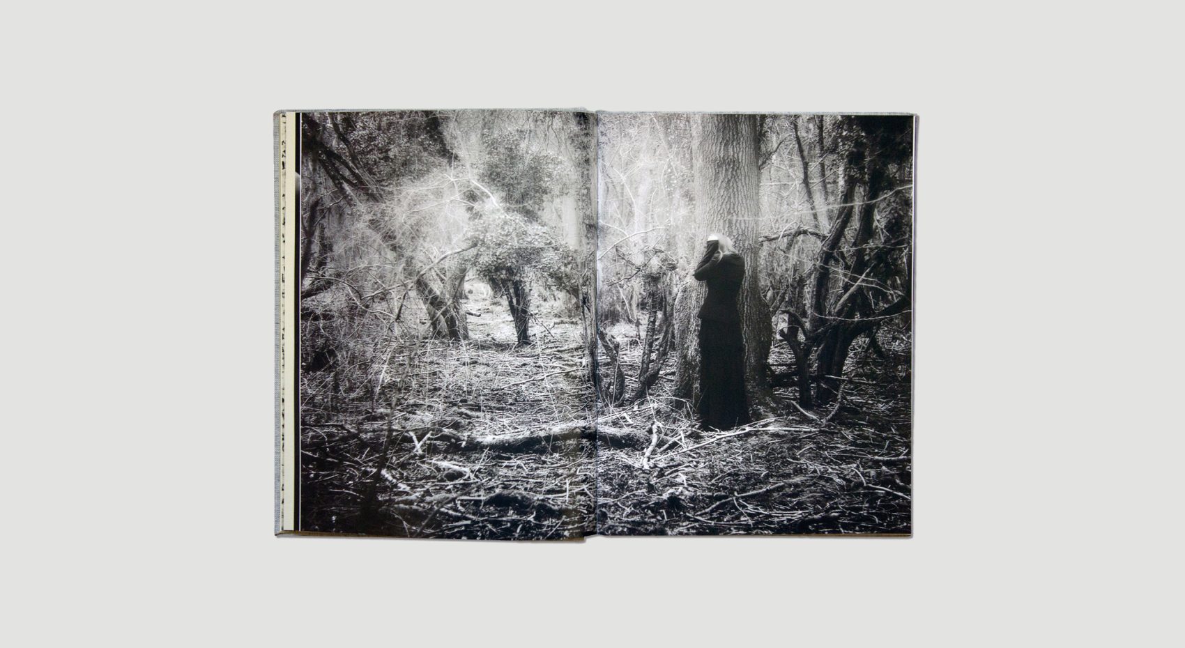
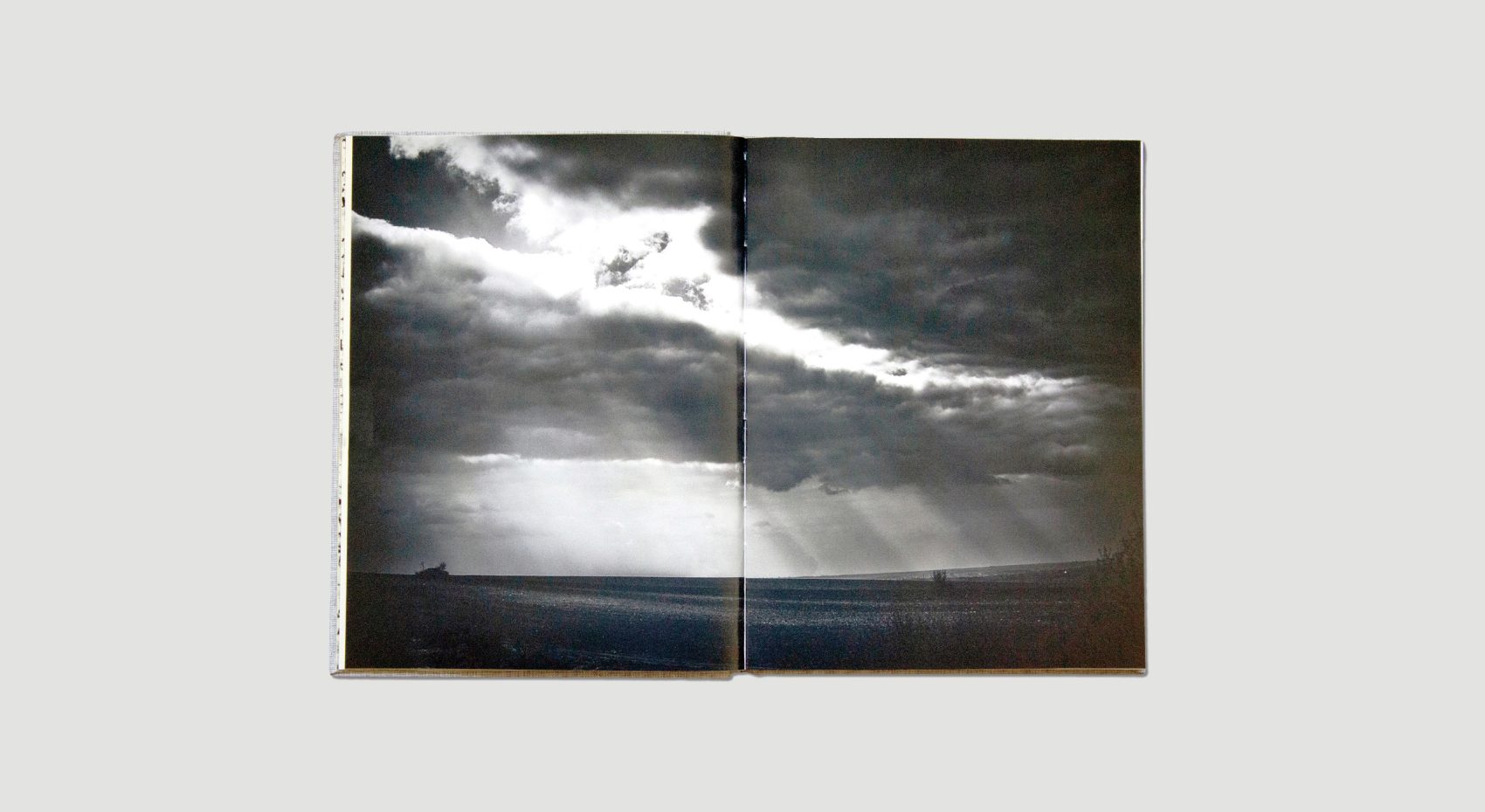
Duotones are images created by using just two colours, usually black and a selected spot grey. Duotones are widely used in traditional print for black and white photography as they give photographs a unique richness and depth. By limiting the number of colours to two, duotones can more easily reflect a specific emotions or moods, as well as reduce the overall cost of printing a book.
Why are they popular in photobooks?
Duotones are popular because they give the book a unique and luxurious appearance. The support colour will be a carefully selected shade of grey. By dedicating a colour specifically to mid-tones, duotones enhance the detail of a photograph. The tone of grey is also importnat as it evokes different feelings and atmospheres, allowing photographers to convey their intended messages more effectively.
Practically, the use of a single grey keeps the design consistent, creating a unified look and feel throughout the book. The reduction of plating from four to two in printing can also meaningfully reduce the production costs.

Choice of second colour
The choice of the second colour in a duotone is crucial, as it greatly affects the tone and mood of the photobook. Here are a few examples of what it can do:
Mood and Atmosphere
Different colours can make people feel different emotions. For example, warm colours can create a intimate or close feeling, or soften an image, while cool colours can sharpen an image or make people feel calm or sad.
Theme Support
The second colour can help support the main theme or topic of the photobook. For example, earthy colours can go well with nature-themed books, while cooler colours can add energy to books about city life or street scenes.
Consistency
Using the same second colour throughout the book helps keep everything looking the same and makes it easier for people to follow the story. It also makes printing a book more reliable and cost effective on press.
Ultimately, the choice of the second colour in a duotone is very important, as it helps set the tone and mood of the photobook, and influences how people see and understand the images inside.
This is why that VIKA created a range of bespoke duotones for the books that we print. See our Bespoke Duotone Service for more information.
You might also like

Free Mines Coal Faces
Nick Hodgson

I Also Fight Windmills
Ania Ready
